MWML [INPUT]-Tag
Creates a simple or complex input field in the editor whose value is rendered into the mailing or landing page.
Usage
Email templates, landing page templates
Syntax
[INPUT type='...' name='...' ... /]
Attributes
General
The following attributes work in all input types.
Attribute | Value | Description |
type1 | Simple inputs: char, text, url Complex inputs: boolean, select, color, a, img, a_img HTML-Inputs: span, p, h1, h2, h3, h4 | Defines the type of input |
name1 | Name | Name of the input. Must not contain special characters and uppercase letters. Digits, hyphens, and underscores are allowed. |
label | Text | Displayed label of this input in the editor |
label_de | Text | German translation (optional) |
| label_en | Text | English translation (optional) |
descr | Text | Description text |
descr_de | Text | German translation (optional) |
descr_en | Text | English translation (optional) |
required | Values: true, false2 | If true, the surrounding [BLOCK] will not be rendered if this input is not filled. |
hidden | Values: true, false2 | If true, this input will not be rendered in the output. |
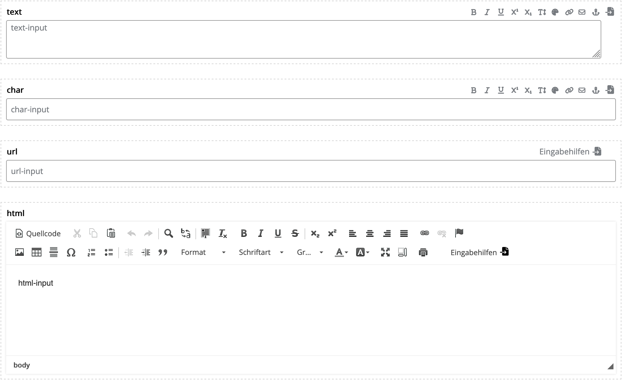
Simple and HTML Inputs
Simple Inputs
Types: char, text, url, html
These types only differ in how they are displayed in the editor. The input type='html' creates either a WYSIWYG editor or a textarea depending on the user's system settings.
Template source code
Editor view
Output source code
Template source code
- [INPUT name='text' type='text' default='text-input' /]<br />
- [INPUT name='char' type='char' default='char-input' /]<br />
- [INPUT name='url' type='url' default='url-input' /]<br />
- [INPUT name='html' type='html' default='html-input' /]
Editor view
Output source code
- text-input<br/>
- char-input<br/>
- url-input<br/>
- html-input
Attribute | Value | Description |
index | Values: true, false2 | If true, the value of this input is used as a table of contents entry. |
default | Text | Default value when a new content is created with this input. Example: default='This is the article text.' |
editor-form-layout | default2 textarea wysiwyg | Only type='html' Allows overriding the "Editor for HTML elements and HTML mailings" setting in "Personal Settings"/"System Settings". |
landingpage-link | Values: true, false2 | For the "Create landing page from email" function. If true, the landing page link is written to the input when a landing page is created from the mailing. |
HTML Inputs
Types: span, p, h1, h2, h3, h4
These types render the corresponding HTML tag in the output.

Inline editing only works with HTML inputs.
Attribute | Value | Description |
index | Values: true, false2 | If true, the value of this input is used as a table of contents entry. |
default | Text | Default value when a new content is created with this input. Example: default='This is the article text.' |
attributes | Text | Attributes for the HTML tag. Example: attributes='class="my_class" style="border:solid 1px #000;"' |
inputassistance | Values: true2, false | If false, the input assistance tools  are hidden at the input. are hidden at the input. |
rows | Integer | Number of rows of the text field. Example: rows='4' |
Complex Inputs
Checkbox
Type: boolean
Template source code
Editor view
Output source code
Template source code
- <div style="background-color: #cecece;[BLOCK name='settings' label='Einstellungen' independent='true'] padding: 20px;[INPUT
- type='boolean'
- name='display-padding'
- label='Innenabstand anzeigen'
- default='1'
- required='true'
- hidden='true' /][/BLOCK]">
- Lorem ipsum dolor sit amet
- </div>
Editor view

Output source code
Checkbox deactivated
- <div style="background-color: #cecece;">
- Lorem ipsum dolor sit amet
- </div>
Checkbox activated
- <div style="background-color: #cecece; padding: 20px;">
- Lorem ipsum dolor sit amet
- </div>
Dropdown/Single Selection
Type: select
| Attribute | Value | Description |
| option-values | Text | Values of the selection options. Separate the values with pipe operator. Example: option-values='|info|warning' |
| option-labels | Text | Labels of the selection options (optional). Separate the labels with pipe operator. Example: option-labels='please select|Info|Warning' |
| option_labels_de | Text | German translation (optional) |
| option_labels_en | Text | English translation (optional) |
| default | Text | Default value when a new content is created with this input. |
Example: Dropdown Input
- [INPUT type='select'
- name='style'
- label='Style'
- option-values='|info|warning|question'
- option-labels='please select|Info|Warning|Question'
- default='info' /]
Colorpicker
Creates a colorpicker in the editor. Depending on the attributes used, either the color code or a CSS class is output.
Type: color
| Attribute | Value | Description |
| color-values | Color(s) (Hex) | Predefined colors. Format: Hexadecimal or color name. Example: color-values='|#ff0|#fff' |
| color-labels | Text | Labels of the colors (optional). Example: color-labels='Black|White' |
| color-labels_de | Text | German translation (optional) |
| color-labels_en | Text | English translation (optional) |
| color-classes | Text | Renders the stored CSS class name. Example: color-classes='black|white' |
color-custom | Values: true2, false | Determines whether custom colors can be selected. |
default | Color (Hex) | Default value when a new content is created with this input. Example: default='#fff' |
Example: Colorpicker
- [INPUT type='color'
- name='my-color'
- label="Color"
- color-values='#08f279|#ffffff'
- color-labels='green|white'
- default='#08f279'
- color-custom='true' /]
Link Input
Type: a
| Attribute | Value | Description |
| default_href | URL | Default link URL |
| default_text | Text | Default link text |
| default_comment | Text | Default comment (for mailing/landing page statistics) |
Example: Link Input
- [INPUT type='a'
- name='textlink'
- label="Textlink"
- default_href='https://example.com/'
- default_text='Read more' /]
Image Input
Types: img, a_img
| Attribute | Value | Description |
| default_href | URL | Only a_img: Default link URL |
| default_comment | Text | Only a_img: Default comment |
key_width | Values: true, false2 | If true, the "Image width" input field is displayed. |
key_height | Values: true, false2 | If true, the "Image height" input field is displayed. |
key_src_mobile | Values: true, false2 | If true, the input fields for the mobile image are displayed. |
key_width_mobile | Values: true, false2 | If true, the "Image width" input field for the mobile image is displayed. |
key_height_mobile | Values: true, false2 | If true, the "Image height" input field for the mobile image is displayed. |
default_src | URL | Default URL of the image |
default_alt | Text | Default alternative text of the image |
default_width | Integer | Default width of the image. Example: default_width='200' |
default_height | Integer | Default height of the image. |
default_src_mobile | URL | Default URL of the mobile image |
default_width_mobile | Integer | Default width of the mobile image. |
default_height_mobile | Integer | Default height of the mobile image. |
desktop | Values: true2, false | true: Display image at this position in the desktop view. |
mobile | Values: true2, false | true: Display image at this position in the mobile view. |
Example: linkable image
Source code of the template
- [INPUT type='a_img'
- name='image'
- label='Image'
- default_src='https://example.com/images/logo.png'
- default_href='https://example.com/'
- default_alt='Logo'
- attributes='class="article-image"' /]
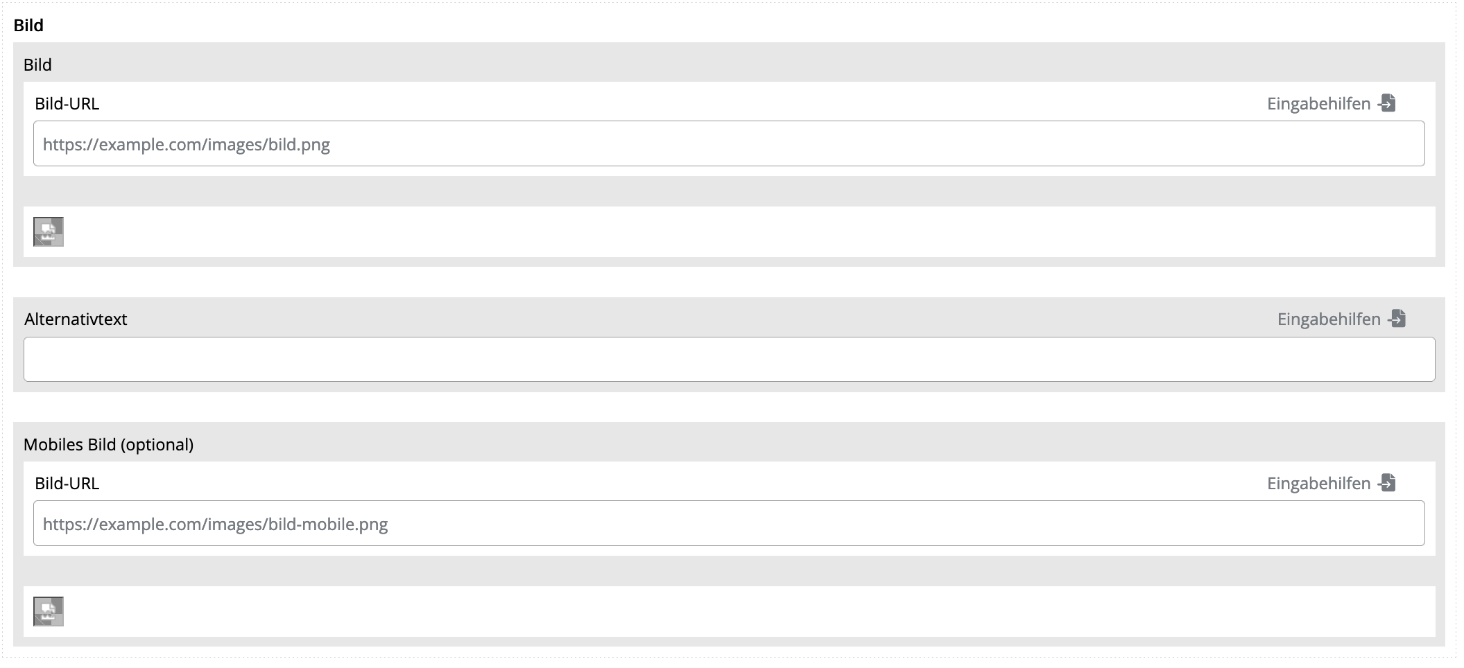
Example: Alternate Image in Mobile Display
If you activate the mobile image using key_src_mobile='true' and mobile='true', the desktop version of the image will be placed within <span class="none">...</span> and the mobile version within <div class="mobile" ...></div>. You must add the following instructions to the Media Queries:
Template source code
Editor view
Output source code
Template source code
- <head>
- <style>
- @media screen and (max-width: 768px) {
- .none {
- display: none !important;
- }
- .mobile {
- width: auto !important;
- max-height: inherit !important;
- overflow: visible !important;
- float: none !important;
- display: block !important;
- }
- }
- </style>
- </head>
- <body>
- [INPUT type='img'
- name='image'
- label='Bild'
- default_src='https://example.com/images/bild.png'
- key_src_mobile='true'
- default_src_mobile='https://example.com/images/bild-mobile.png'
- mobile='true' /]
- </body>
Editor view
Output source code
- <head>
- <style>
- @media screen and (max-width: 768px) {
- .none {
- display: none !important;
- }
- .mobile {
- width: auto !important;
- max-height: inherit !important;
- overflow: visible !important;
- float: none !important;
- display: block !important;
- }
- }
- </style>
- </head>
- <body>
- <span class="none">
- <img alt="" src="https://example.com/images/bild.png" />
- </span>
- <!--[if !mso]><!-->
- <div class="mobile" style="width: 0px; max-height: 0px; overflow: hidden; float:left; display: none;">
- <img alt="" src="https://example.com/images/bild-mobile.png" />
- </div>
- <!--><![endif]-->
- </body>
RSS Integration
See RSS Integration
Attribute | Description |
feed-path | The desired node in <item> (title, link, description, …) |
feed-path_<key> | Node for complex inputs or link inputs. Example: feed-path_href='link' |
Microdata Integration
| Attribute | Description |
| microdata | Path to the microdata element. Separator is the hyphen -. Example: product-offers-priceCurrency |
| replace_path | Replaces parts of a URL. Syntax: replace_path='<SEARCH>|<REPLACE>' Example: With replace_path='web|email'", the URL https://example.com/images/web/product.png becomes https://example.com/images/email/product.png. |
1. Required information
2. Default: If the attribute is omitted, it is automatically initialized with this value.